
Oops! Something went wrong while submitting the form.

YouTube thumbnails let viewers see a quick snapshot of your video as they're browsing YouTube. Learn how to create an eye-catching YouTube thumbnail that boosts viewership and is good for YouTube SEO. Follow these YouTube Thumbnails best practices.
You can also get a summary of this blog post as a checklist. Download it right now by clicking the button down below and read more about each point further in this article. The YouTube thumbnail is a key factor to make your video stand out and get views!In this guideline, you'll learn everything you need to become an expert at making video thumbnails that pop. Ones that will immediately grab a person's attention and make them eager to watch your video and hear whatever it is you have to say.YouTube Certified expert Jan Fassbender of So geht YouTube explains the dos and don’ts in this video→
In this comprehensive guide we’ll cover:
PART 1 (Theory): Understanding YouTube Thumbnails
PART 2 (Hands-on): How to create thumbnails that stand out and get you more viewsStep-by-step instructions to create YouTube thumbnails, including
So let’s get started.
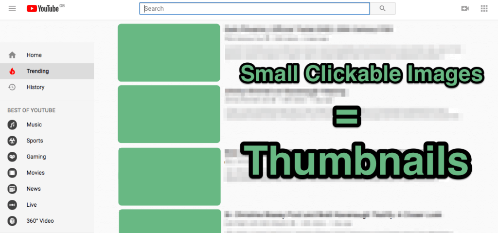
Simply put...a YouTubethumbnail is a reduced size version of an image. This thumbnail is the first thing a person will see when they are browsing and trying to decide which content will give them the best solution or answer to whatever it is they're looking for. So, to sum it all up, YouTube thumbnails aresmall clickable imagesthat a viewer can click on to watch any given video of their choice. Thumbnails are like the cover of a book. Most people willliterallyjudge a book by its cover and that cover is what makes them curious enough to consider and then ultimately purchase a book,or not.
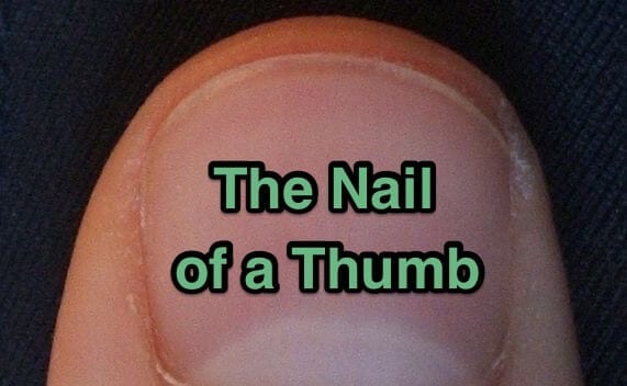
Video thumbnails got their name because originally they were about the size of a person's...yep, you guessed it—thumbnail. Thumbnails came about because they make it easier to show a variety of images in one space.
They are also a better use of space because a small picture is used to represent a larger video of the same image. And, that thumbnail picture can be clicked on to get to the full-size image. It was also discovered that thumbnails reduce bandwidth and download time, which is extremely important because people don't like to (and won't) wait for a video that takes too long to load.
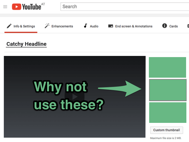
Thumbnails make it easier for a viewer to control what they want to see because the thumbnail will give them a quick overview of what the video is all about. Therefore, a top-quality custom video thumbnail is whatwill make your content stand out.But do you really need a custom thumbnail for your video? Why not just grab any old snapshot and use that? Or, since YouTube provides you with suggested thumbnails by default, why not use one of those? Besides, you already have a killer headline right?
This is why...
90 percent of the best-performing videos on YouTube have custom thumbnails. YouTube Creator Academy
Think about how people browse through YouTube video posts in an effort to find one they want to watch. That process consists of two things—the attention-grabbing headline and the curiosity building thumbnail...right?Then, as you are finished watching that video, another thumbnail will catch your eye and the intrigue will have you clicking on another, and another, and another. Yep! That's how it's done—that's how we all do it.How many people do you know that actually read the verbiage first?Exactly! So...do you really need a custom video thumbnail?YES... YES, YOU DO!
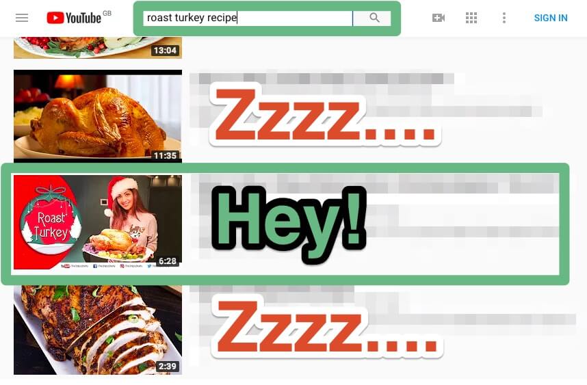
Of course, YouTube thumbnails are most commonly used to grab viewers' attentionandbuild curiosity. But video thumbnails are also specifically designed to:
Your video thumbnail has the ability to make or break your brand in a split second. Why?Because many people will make an immediate decision about how they feel about your brand based solely on their first impression of your video, which initially is your thumbnail. So make it a good one. In addition, the thumbnail photo you choose is the one chance you have to grab a person's attention and to make them curious enough to want to watch your video.
Think of your YouTube thumbnail as a headline. It has to be something that is eye-catching and something that builds enough curiosity to make a person eager to click andwatch your video to the end. The 6 things you need to consider are:
In the following, we explain to you how to handle this.
There are several different things you can do to make your YouTube video thumbnail stand out above all others.1. Choose the Right Video Thumbnail Size Using the right YouTube video thumbnail size makes all the difference in the world. If you want the best picture quality on both desktop and mobile devices, it is best to use a 1280 x 720-pixel size (16:9 ratio). Save it as a .JPEG, .PNG, .GIF, or as a .BMP. Try to use as high a resolution as possible (however, keep it under 2MB).
2. The Background Image Matters Use a background image that will complement the message you are trying to convey without it being so "busy" that it distracts from everything else.

3. Overlay Background Image with Text If you want to enhance your YouTube thumbnail background imageoverlay your images with branding and descriptive text, making sure you use a font and colors that are easy to read. You should also be sure your verbiage includes the title or select keywords as well.

4. Choose a Custom Font Anything you do that makes your video stand out will help increase its viewership. So using a custom font is just one more thing that will makeyour video seem special, different than every other video on YouTube. You can find the best thumbnail fonts at theFontShop. You simply select the appropriate font category, scroll through the available fonts, select one then download it.
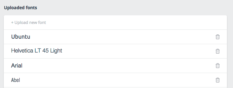
5. Use the Right Colors If you want your video thumbnail to be effective, the added verbiage has to be easy to read. So make sure you use colors that not only complement your video, but colors that are also easy to read. Once you have your custom font, colors, and verbiage added to your thumbnail, take some time to test it to see how it looks and how well it stands out when posted amongother YouTube videos.

6. Select the Right Picture The picture you use needs to be something that will be memorable, grab attention, and something that will make someonewantto click your video and watch it through to the end.Other tips for selecting the right picture include using a close-up of the subject (people are generally more drawn to pictures of people and direct eye contact), using extremely expressive faces, bright images, and the proper lighting. Also, don't forget to split test your images and thumbnails to make sure you are always using the most effective one for any given message.

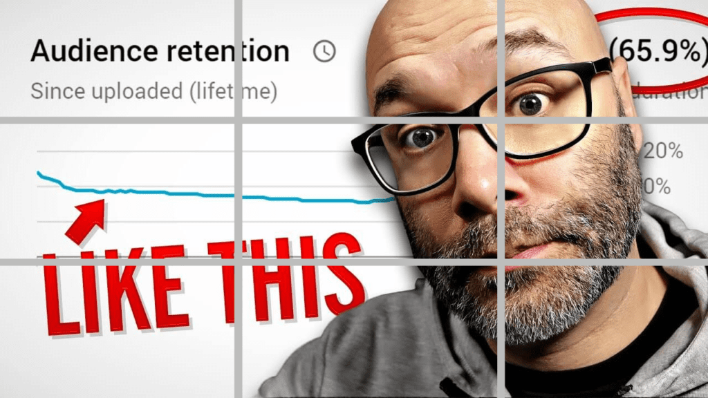
7. Apply the “rule of thirds” The rule of thirds is a technique used in photography to create more balanced and engaging images. It involves diving up the image using 2 horizontal and 2 vertical lines. Then you position the important elements along the lines or at the intersections.
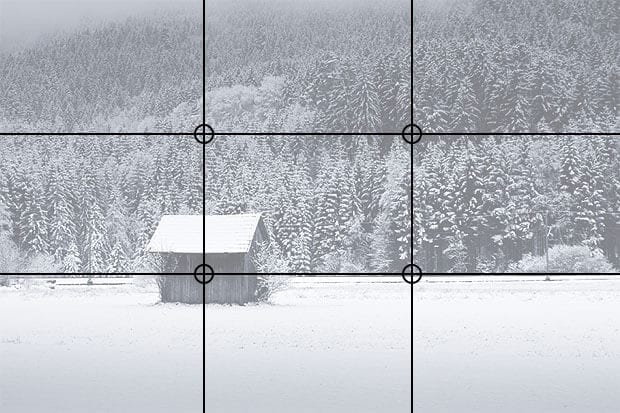
The same technique can be used when creating thumbnails. We are naturally drawn to people's eyes. Place them at one of the intersections on the rule of thirds to give a thumbnail a clear focus point:
8. Make Your Brand Recognizable The most successful videos on YouTube use their branding or some other consistent character, icon, etc. throughout all their thumbnails so that when seen, a viewer immediately recognizes that the thumbnail they're looking at belongs toyourbrand. This is how you develop a connection with your viewers. People like familiarity and the feeling as if they belong. So doing this will help youbuild your brand, as well a loyal following. Not to mention increasing your video's potential for going viral. Just like a trusted friend.
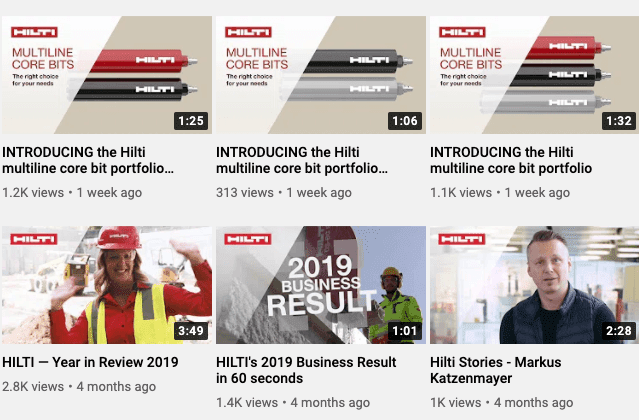
Currently, there are several thumbnail design trends that make for successful thumbnail designs. Here are 4 of the most popular.
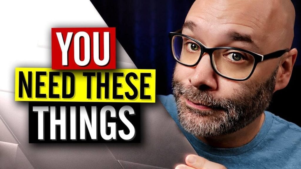
Many YouTube creators choose to use a thumbnail of a face. This face is usually the face of the person that's featured in the video or the person that the video is about.Your brain is hardwired to respond to faces. Read more here.
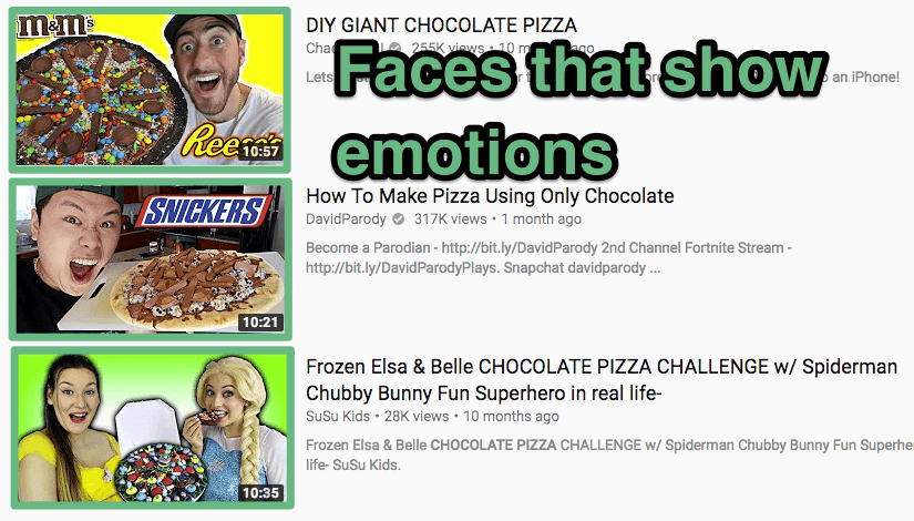

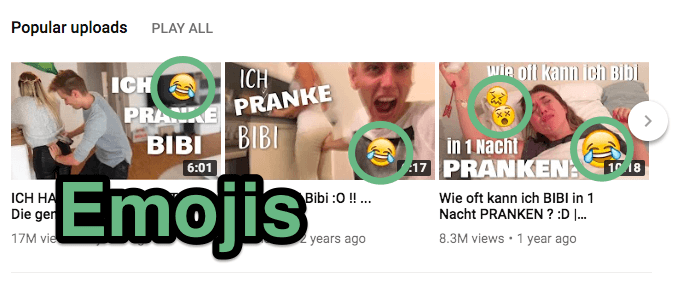
Some people choose to use emoticons in their YouTube thumbnails designs. These recognizable cartoon images are understood immediately by anyone who has encountered emojis before, which means users can quickly understand what the video will be about.
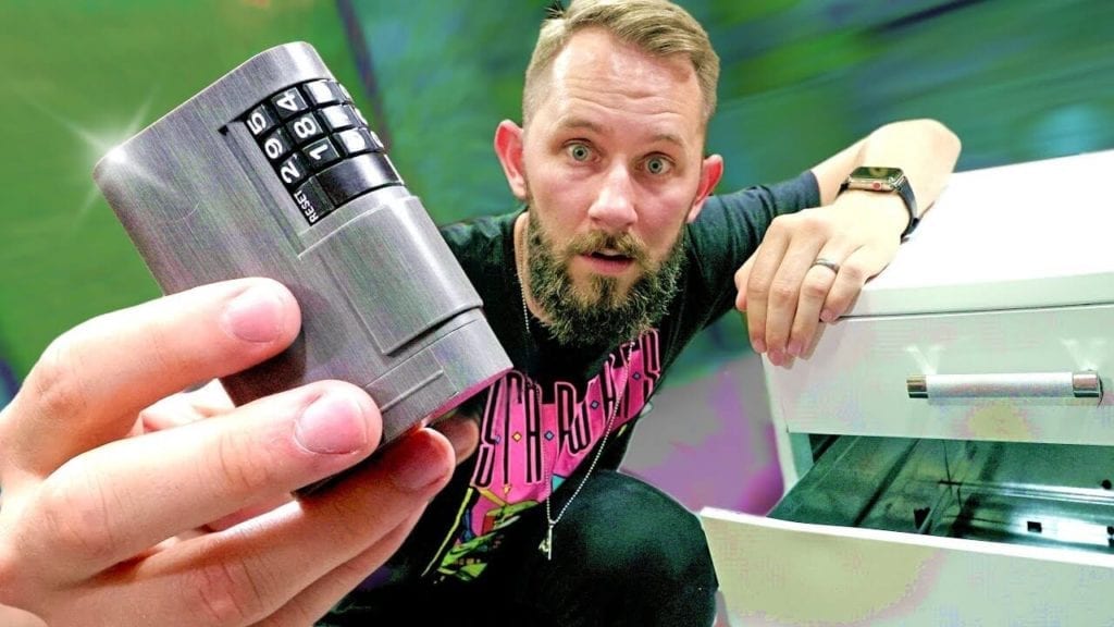
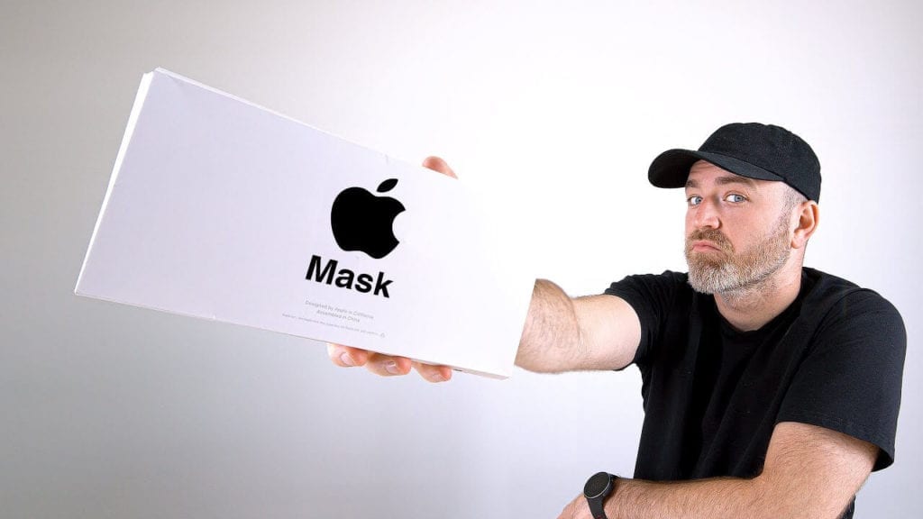
Usually, perspective is used to represent three-dimensional objects on a two-dimensional surface so as to give the right impression of their height, width, depth, and position in relation to each other. When it comes to making thumbnails, you can go creative and try to "distort" objects' normal measures and create interesting setups: big/small, far/close. This visual illusion can attract viewers and make them click exactly on your videos.
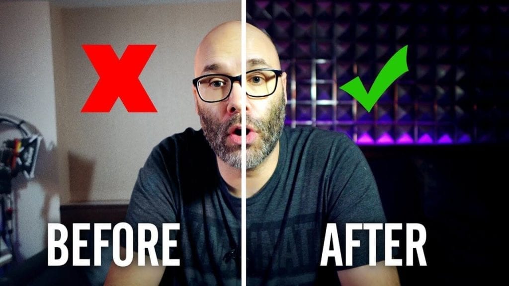
Intrigue viewers with before/after previews on your thumbnail. You can either blur the final result or showcase it depending on what exactly your video is about. For example, if you want to show how to set up proper lighting, it would make sense to show the achieved results. In this case, people would be interested HOW you did it. In the second case scenario, you have an "after" product. For example, image editing and how it got better/worse. You want viewers to find out what is the final results, therefore, you should blue the "after" part to trigger interest.

To catch YouTube users' eyes, many people use clear bold, bright fonts in their YouTube thumbnail designs. These fonts feature the title or a description of the video. Typical Fonts that regularly show up in YouTube thumbnail designs include:
Paid services that might help you are:
While all of the above thumbnail trends are popular choices to make for the cover of your video, there is one factor that leads to thumbnail success -- but that is often overlooked: patterns. While many people don't think to use patterns in their thumbnails, there are many reasons you should consider incorporating patterns when you create the thumbnails for the videos you publish.
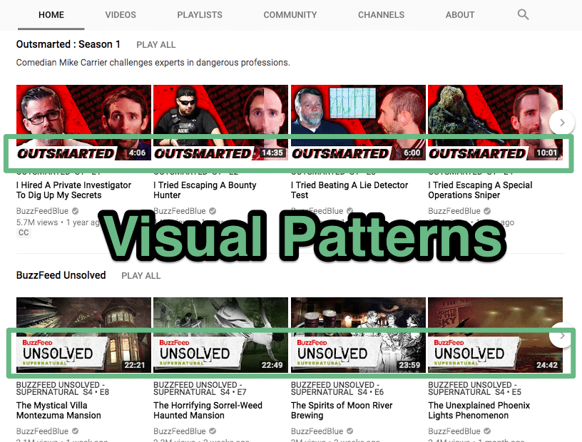
To see some real-life examples patterns YouTube brand channels use effectively in their thumbnails, check out the following channels:


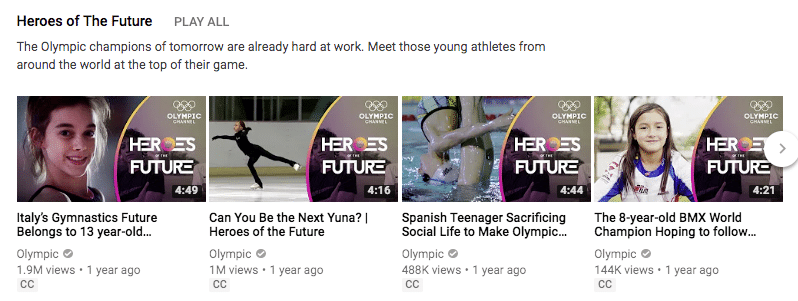
What are the reasons patterns improve the click rates of your videos especially with regard to YouTube's Autoplay Feature?
Human brains are wired to look for patterns. In fact, our brain automatically seeks them out as we look around the world. So, use a thumbnail with a visual that a brain will seek out and then be drawn to, encouraging the user to click.
Your own brain isn't the only thing that seeks out patterns. YouTube's own Neural Network algorithm is programmed to look for patterns since it knows that patterns are what human brains want to see. So, if you want your video to be suggested by YouTube more often, you can incorporate it into your thumbnail design.
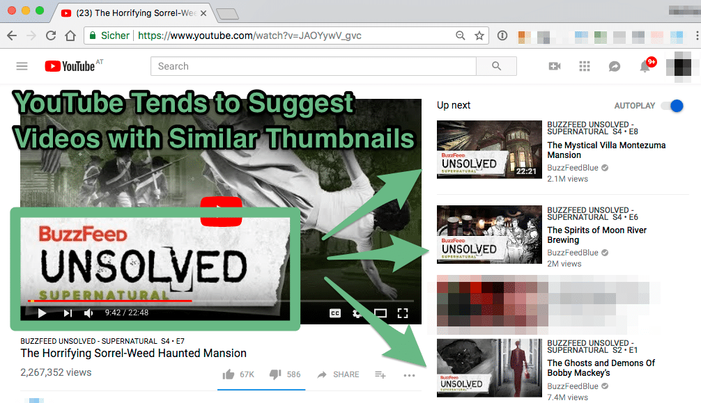
You want to use YouTube to promote your brand, so your thumbnails and content should consistently align with your company's aesthetic and products. If you use similar patterns in your thumbnails, you can help promote brand consistency and make your videos and identity more recognizable across the web.
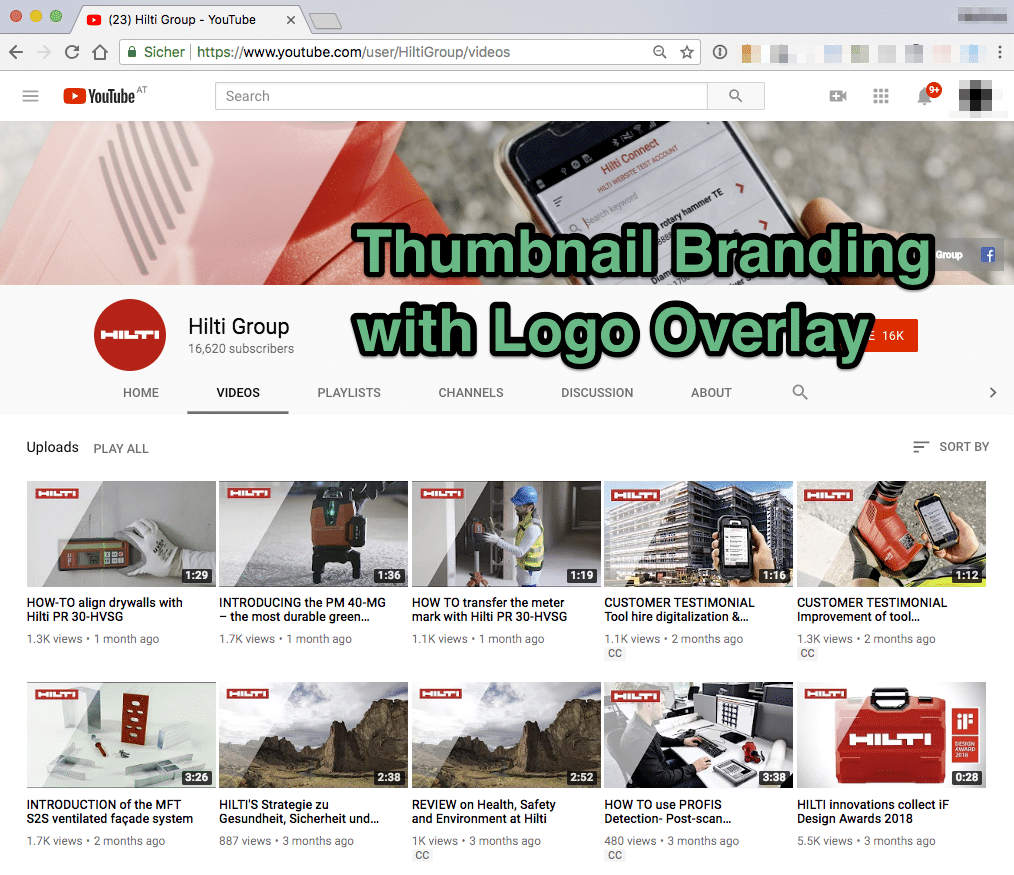
Since patterns are just the same images repeated over and over, they are easy to create. A thumbnail that simply uses a pattern can be made with minimal time and effort with tools like
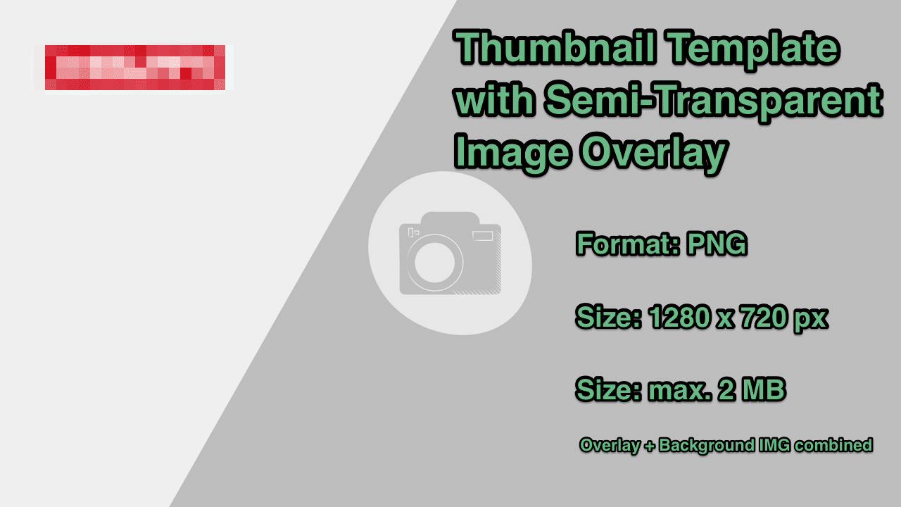
An easy way is to create a thumbnail template that you can apply as an overlay layer to a frame of your video.
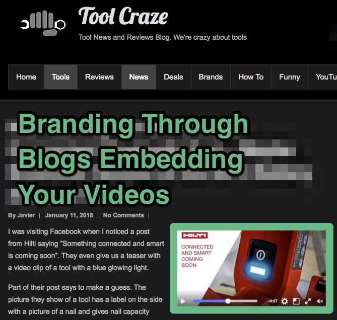
When people embed your YouTube video on their own site or social media pages, your thumbnail can help serve as a billboard for your company. The video, once played, becomes an interactive advertisement, making for helpful brand promotion.
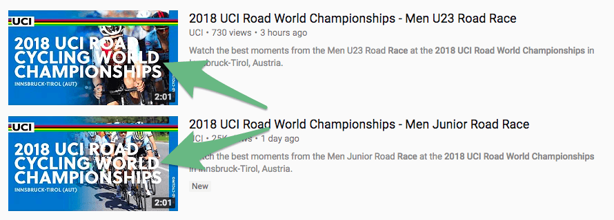
If you want to create patterns that can serve as your YouTube video thumbnails, here are the key elements to include:
Sometimes the video thumbnail is the last creative step taken when producing a video. Therefore, people have a tendency to just grab any old video snapshot to use without giving it any further thought. But this is the worst thing you could do. You wouldn't do that for your headline, so why would you do that for your video's thumbnail?So—just don't!Here are the top six thumbnail mistakes people make and how you can avoid them.1. Using Too Much Text One of the most common mistakes people make when designing a custom thumbnail is to put too much text on it. They are understandably trying to capture attention, build intrigue, and get their message across. However, having too much text will only distract from the thumbnail itself and ultimately have the opposite effect you were trying to create in the first place.
If users can’t read the text in one quick, sideways glance, it’s too much. You should never have more than a concise title, and, if absolutely necessary, a concise subtitle in smaller text beneath it.2. Unflattering Facial Expressions As you know, it's best to use a person's face on your thumbnail. However, be mindful of the expression that's captured when you take the snapshot. Some facial expressions are pleasant and flattering and some are not. You don't want the expression you've captured to look bored, scared, in pain, or to have a fake smile, etc. It's best to take as many snapshots as possible so you'll have a wide variety to choose from.

3. Boring Thumbnails Try to avoid using a dull looking snapshot for your thumbnail. Things like charts and graphs that don't have much color, etc. If possible, use a person's face and give it a little character so people see something they feel like they can personally connect with.
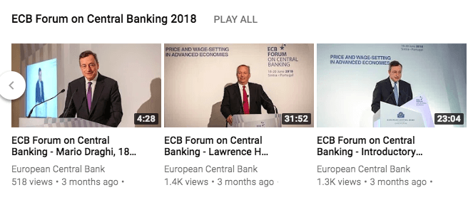
4. Hard to Detect Play Button Sometimes the location of the play button as it's seen on the thumbnail appears to be a part of the picture. This means it can be easily mistaken as part of the picture and not seen as the play button. Therefore, make sure you check this so you don't lose weeks or even months worth of traffic while wondering why no one is watching your video. You can avoid this problem by using the small play button in conjunction with the play bar. This will make it clear that your thumbnail is a video and not just a picture.5. Too Much Motion Having too much motion or action in your video can cause a thumbnail to be blurry. So try to limit your thumbnails to snapshots that aren't action shots.

6. Play Button Face Always make sure the person's face in your thumbnail isn't covered up by the placement of the play button. You don't want your viewers to see your subject's face completely covered with a big arrow. The whole idea of using a human face is for the eye contact, so make sure your picture is taken in a way that the subject's face can be clearly seen. If you publish and share content on YouTube, it's important not only to think about the content you create but also your YouTube presence itself. YouTube allows you to create a profile for your company or business, and this profile should be a clear representation of your brand and what you do, including your aesthetics, value, message and more. One important part of your YouTube presence to customize is your thumbnail design. The thumbnails are the small images that serve as the sort of "cover" for each video that you create. Video thumbnails appear on your profile page, as well as in search result pages. The YouTube thumbnail is the first impression a YouTube user gets of your video, and they can help determine whether a user wants to watch your videos -- or not.
If you want to learn how to change thumbnail on YouTube...here's how.
Yes, it really is that easy!
What is a YouTube thumbnail creator and do you really need one?Well, a YouTube thumbnail creator, also called a YouTube thumbnail generator, is a design tool that comes with a YouTube thumbnail template that you can use to upload your images and add them to a layout, add your own custom text, choose from a library of icons and more without having to go through each design step manually while trying to build the thumbnail yourself. Do you really need one? No, not really, but it sure makes things a whole lot easier, so why not go ahead and use one? Start a FREE trial and sign up with your Google account to create amazing youtube thumbnails with our thumbnail creator. Give it a try and see what you think. Now that you have your custom YouTube thumbnail already to go, whether you designed it yourself or used a YouTube thumbnail generator, you will need to get some eyeballs on your video...right? The best way to do just that is to enlist the help of some thumbnail software.
Thumbnail software could be confused with thumbnail creators, but this is not the case with all thumbnail software. Some thumbnail software programs are thumbnail creators and some are used for SEO purposes. The most popular thumbnail software is actually a YouTube SEO software that helps YouTube channel owners to rank their videos higher on YouTube, Google, and more. Our YouTube SEO tool is calledTubics. There are plenty of reasons to give our thumbnail software a try. Here's why... What does the Tubics YouTube SEO software do?
You went to the trouble of making a custom thumbnail, so why wouldn't you take it one step further and enlist the help of some thumbnail software? This will help you see more significant results and see them much faster than if you were to try and build video views and rankings without it. So, what's next? Before you go any further, you should take a few minutes to learn the most common thumbnail mistakes and how you can avoid them.
1. First, you will need a background for your thumbnail. Google Images is a good place to start. You simply put this in the Google Images search: "1280 x 720" because this is the size you'll want to use as it's the size that is most suitable for both desktop and mobile viewing.
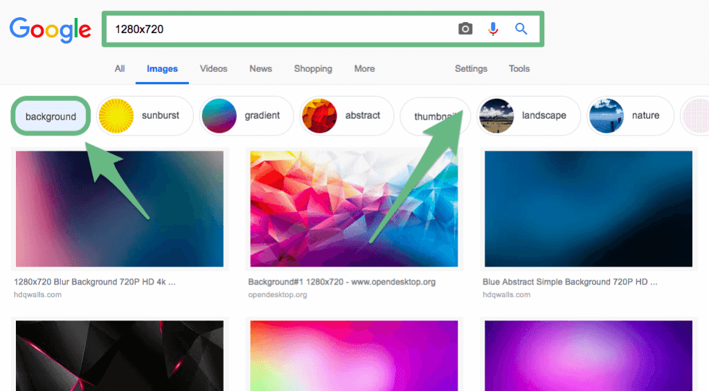
Under "Search tools you can filter the images by"Usage Rights". This way you can find images that can be reused, reused for commercial purposes, modified, or reused and modified for commercial purposes. 2. Now choose the background that will best fit your message and copy it by hitting the right click button on your mouse then clicking on "copy image." If your image editor doesn't support copy-pasting you can save the image instead of copying it.
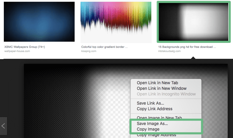
Open your image editor and paste the image you just copied. Now you will need to find a custom font to use.
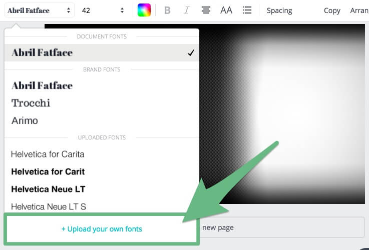
3. You can find custom fonts on any custom font site, such asFontShopor Typekit. Just select the appropriate font category, scroll through the available fonts, select one then download it.4. Open the custom font zip file you downloaded and install it.5. Now go back to the image editor.6. Type the verbiage you want to use over the background image. Now you're ready to custom design your thumbnail.
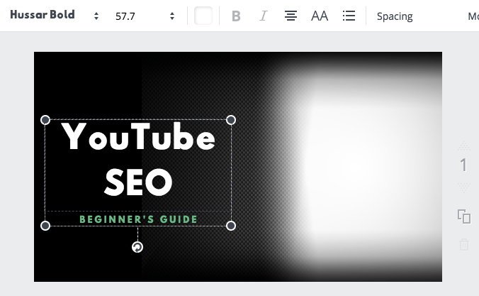
7. To design a custom thumbnail, you can add any transparent clipart, pictures, etc. to your background image. Anything that will grab someone's attention. Just make sure you are adhering to YouTube's Terms of Service. And don't add anything that could be misconstrued, is confusing, misleading, or inappropriate in any way.
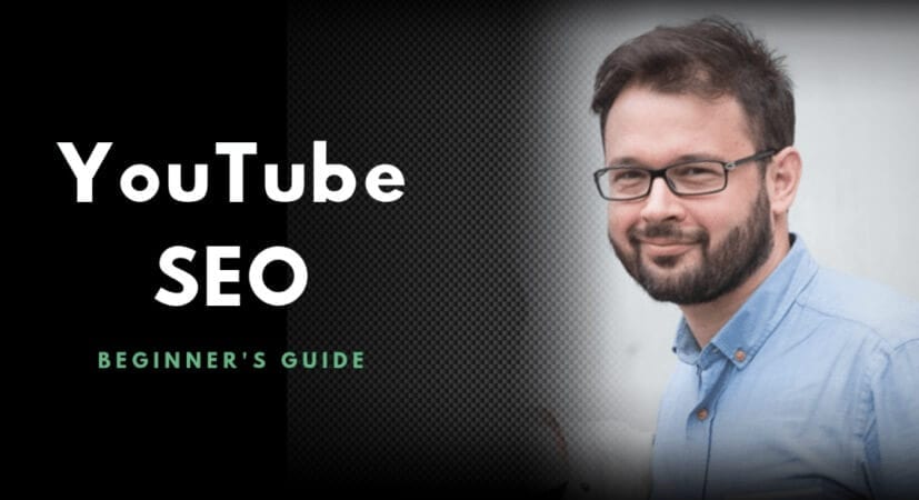
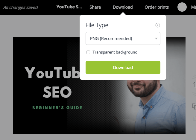
Have fun with this step. Play around with different types of pictures and clip art until you find ones that pop.8. Once you are finished customizing your thumbnail, you will need to save it. It's best to save it as a .PNG if you want the best quality image possible. If your image file is more than 2MB then you will need to save it as a .JPEG or .JPG. However, YouTube limits its thumbnails to 2MB so keep that in mind when you will be usingYouTube.
9. Now you can upload your customized thumbnail to the video by clicking on the "Custom thumbnail" option that's provided below the random image selections you will see on the right-hand side of your video.NOTE: You have to have a verified account with YouTube if you want to use the custom thumbnail option. 10. Done! Wasn't that easy?
When designing thumbnails for YouTube you should also be aware of YouTube's guidelines. Here's a list of things that YouTube considers illegal in thumbnail design:
Let's summarize what you've learned then we will go over all the steps that need to be taken to create a custom thumbnail, as well as a reminder of the things you need to look for if you want the most effective YouTube thumbnail possible. You learned why thumbnails are important and that 90 percent of the best performing videoson YouTube had custom thumbnails. So there's no question that you should be using custom thumbnails if you want the best possible chance of success for your video message. Here is a quick summary of the steps for designing a custom thumbnail.
You also learned how to pick a quality thumbnail image, seven tips for making your YouTube video thumbnail stand out, and how to change your YouTube thumbnail. We also discussed whether or not you need a YouTube thumbnail creator and gave you several popular ones from which you could choose. Additionally, we discussed the importance of using thumbnail software and how it could positively affect your SEO and rankings, as well as all the benefits that come from using thumbnail software. Lastly, we went over the most common thumbnail mistakes people make and how you can avoid them. If you implement everything you learned here, you should see a measurable difference in your YouTube video viewership and its related traffic. So...now...what is a custom YouTube thumbnail worth to you?
PRICELESS!
.png)